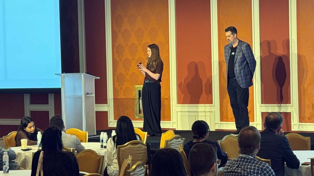
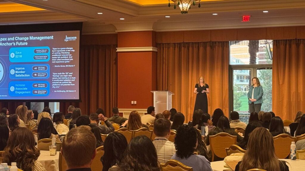
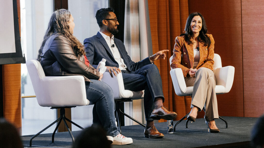
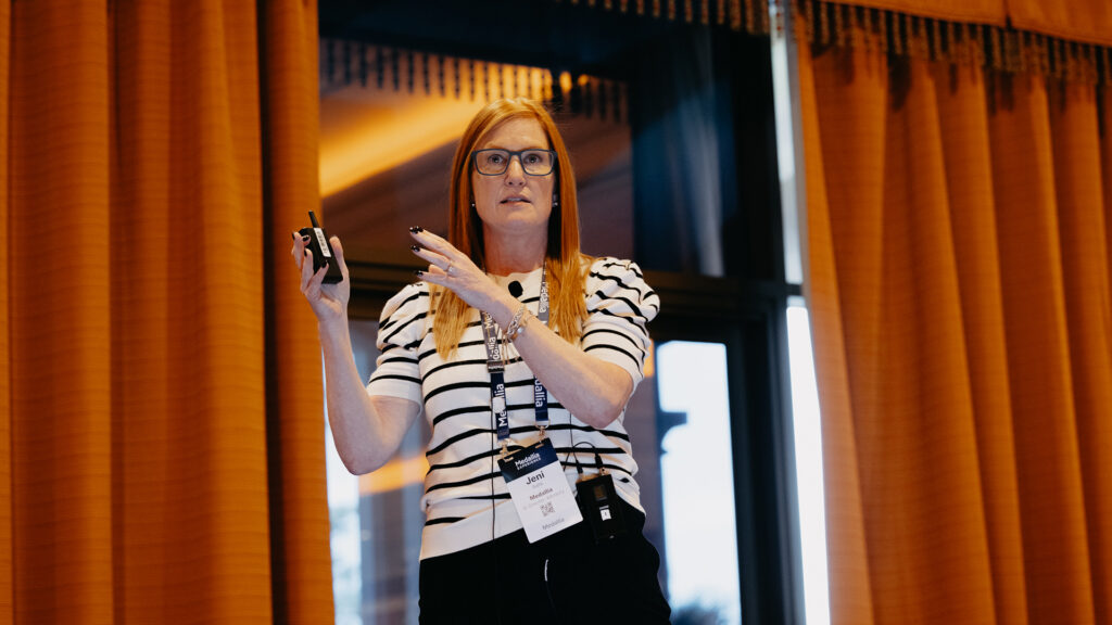
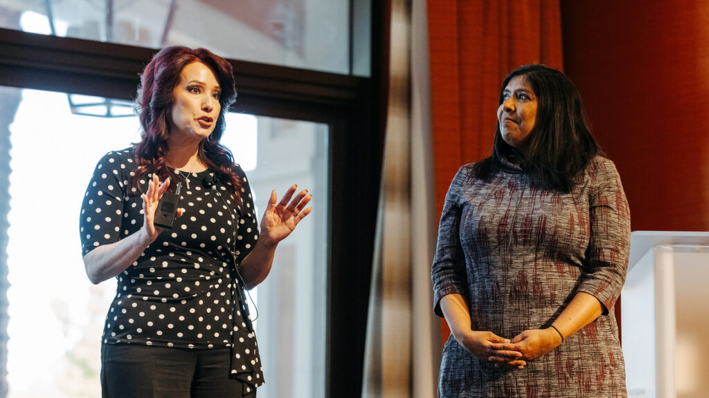
Rachael Ricketts: [00:00:00] Thank you so much for joining us on the very last breakout of the last day of experience. By show of hands, how many of you have brains that are just swirling with ideas and inspiration? Yes. I see some head nods. Us too. Us too. We saw a lot of really cool features and technologies yesterday morning with the keynote and throughout the days as well about generative AI and all of that, that’s to come. Today we are really excited to talk with you about some AI features that are available now immediately. You can deploy them tomorrow. We’re really excited to walk you through some of the best in class features and ways to use text analytics throughout your organizations today.
So your TA set up, you may have attended the TA 1 0 1 session. You might have finished your implementation recently, or maybe it’s been a couple of years. You [00:01:00] have your topics created. You’ve identified what metrics you wanna use for ta, net sentiment impact score. You have it figured out, it’s launched, it’s ready to go.
But one thing that I’ve heard over and over again the last two days is, I don’t know what I don’t know. If we’re here to tell you some things that you don’t know or maybe you know, but not all of them, we’re hopeful that you’re gonna walk out of here with some really practical ideas to take your programs to the next level.
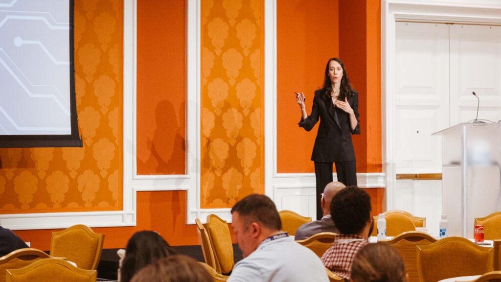
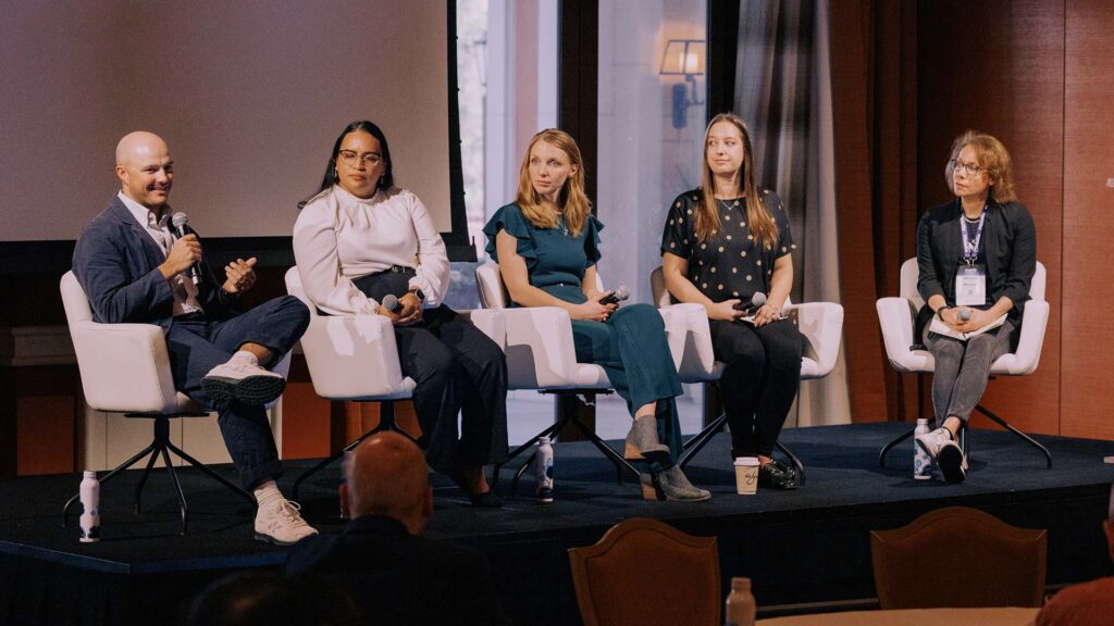
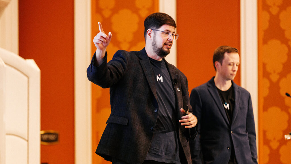
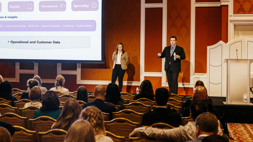
Laura Kramp: So what you’ll be seeing in this session is we’re going to go through some advanced text analytics features that will come alive through some specific use cases, and we’ll be leaning into two key use cases. The first one will be your frontline users and a view that you can build for them that incorporates text analytics but isn’t too much, and then also a couple of views for more of an executive audience.
And all of these views are designed with the goal of showcasing how TA can be made to be easy to consume by [00:02:00] these users and not too overwhelming. So that’s the overarch arching goal for all of them. One thing to call out. So the data in these Debs that we’re gonna be showing you today.
Is based on the CX use case. But the designs and the ideas are also applicable to the employee data, to product feedback, to digital feedback, and to various other signals. As Rachael said, when your TA program is first launched, typically what we see is we launch with the foundational model.
So you’ll have topics and themes and sentiment. And just as a very quick review for anyone who’s not familiar, topics and themes are categorizing what is being said in the conversation. Topics being the set of categories that you can really influence, right? So you can decide what categories do we want to look for based on our business needs, based on what our customers are saying.
And then themes are automatically generated by a machine and they’re just naturally bubbling up whatever is come true in idea. And then those are layered together with sentiment analysis to give you an idea of, okay, when people talk [00:03:00] about. Having to wait a long time when they walk into your store, what percentage of those mentions are positive and what percent are negative?
And that’s the sentiment analysis model that you see layered in. So that’s the baseline and probably for anyone who has Medallia text analytics, I’m sure that’s what you have in your systems. Now in today’s session, we will be weaving in some specialized features. That can be turned on to add additional value for specific use cases.
We won’t be walking through each feature in detail, but we’ll be showing them in the context of a use case specific dashboard. So whether this feature is available today or it’s a feature that released three months from now, all of the features. You available now, and the ones that are coming very soon that we’re all very excited about are really just tools to make, understanding the insights and presenting the insights to various users much, much easier.
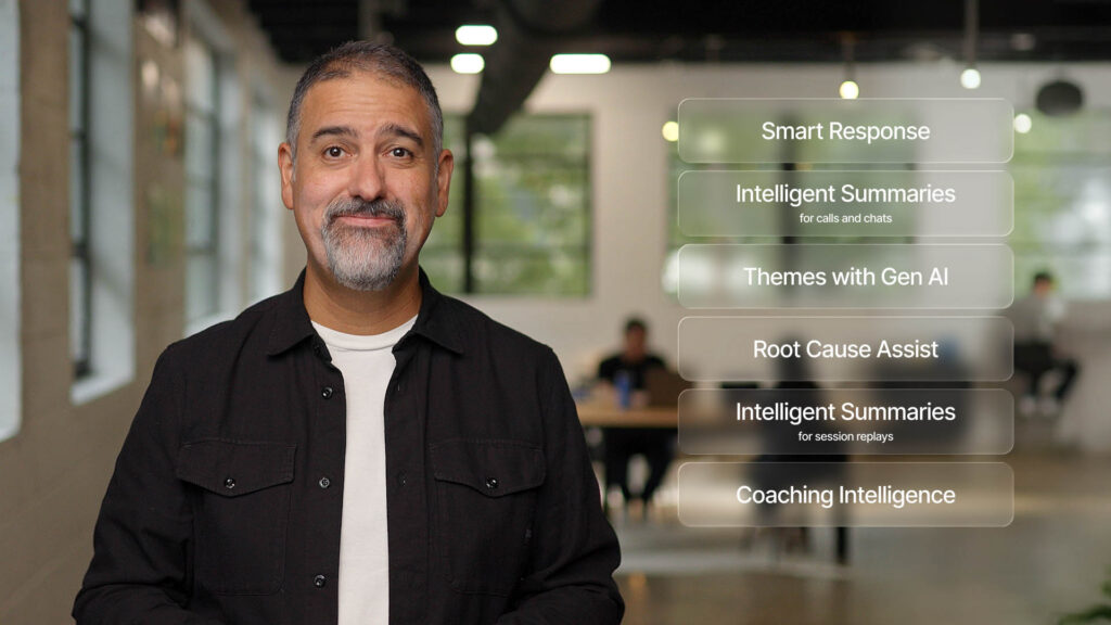
And so all the foundational work that you have is still a good foundation for all those future features. The ones we’ll talk about today and the ones that are coming soon all very foundational that will be [00:04:00] built in upon. We will be showing one of the new generative AI features, that’s the intelligence summaries feature.
And although we will not be showing the new version of themes, you will see the old version of themes in our demo. So you can just use your imagination a little bit for what the new version will look like once it’s in there.
Rachael Ricketts: Like Laura mentioned, we are going to walk you through some of these new features with the lens of a use case.
We’re gonna think about it in as a persona. What do these different end users need to understand? If you attended the reporting masterclass earlier today, you learned about the benefit of using a persona. It’s really so that you can step into the shoes of whomever it is that you’re designing your reporting for.
So meet Tessa. Tessa is a frontline manager. She oversees a large hospitality or hotel property. She’s responsible for service. She’s responsible for guest rooms. You can imagine she’s got a lot going on. She does not have time to spend hours within a [00:05:00] Medallia platform, right? She needs to get the insights quick and easy.
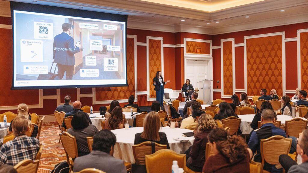
She is always trying to think about tying the scores to the why, tying the what to the why. So let me flip you over to Tessa’s dashboard. So right away, you can see right across the top, we have dials. You’ve seen these before, right? These are the dials that she’s responsible for. These are the key metrics she’s responsible for within her hotel.
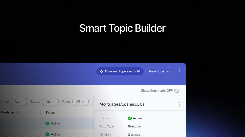
At the very top, we have those scores. As I scroll down, the very next thing we have are the topics, top topics and bottom topics. That’s a really good best practice as you’re designing your dashboards. Don’t let TA only live in a TA tab. Don’t do that. Make sure that TA is front and center for whomever it is that you’re designing for.
So I’m gonna scroll back up to the dials. What I [00:06:00] wanna show you is she is thinking about net promoter score. She’s thinking about service guest room, and she’s thinking about online reputation. Those are the social scores. Boy, she’s got a lot of work ahead of her, doesn’t she? She might be thinking, okay, I really need to get to the heart of my service.
What she’s going to do, she’s gonna click on that service dial. Over to the right. That there’s a side panel that has come out. I’m gonna make it a little bit bigger by clicking this arrow up at the top so you can see it. The very first thing is a trend line. We’ve seen these trend lines often, but they often give us context into what we’re looking at.
We can see, okay, it’s been a pretty rough, rough go with service, especially in October, November. Noted. As I scroll down, you see the most impactful topics. Again, what you might notice. The only topics you’re seeing are service related because I clicked on that service dial. I’m tying the what, the metric to the why, [00:07:00] the ta.
So here I can see right away if I’m Tessa, that I’m getting some really good feedback around speed of service and friendliness. Fantastic. I’d like to use that to recognize my staff, however. Looking at the bottom topics, I can see I’ve got some work to do with food and beverage. Looks like attitude, oof, friendliness.
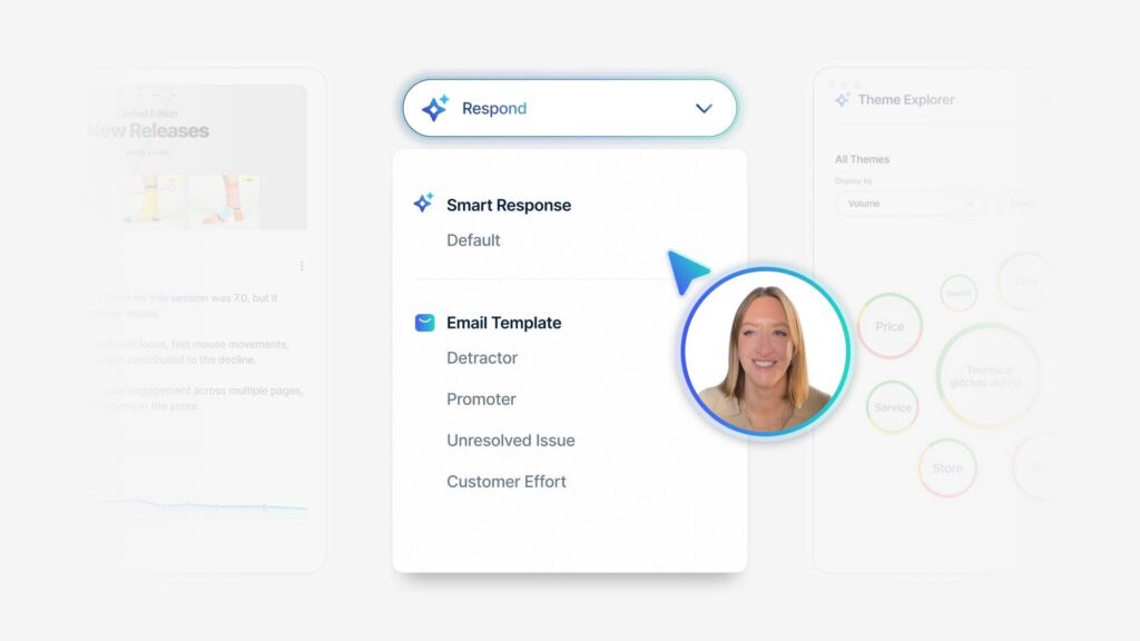
Those are driving down my scores. So what I’m gonna do then is I’m gonna click on that, that topic, and what comes up next are themes. Themes using phrase level filtering. That was on one of, on the slide that Laura walked you through. Let me tell you what phrase level filtering means with text analytics.
It takes a look at all of the commentary that’s coming in, regardless of channel. It identifies as phrase, and then it assigns the topic to the phrase, so you know what is being spoken about. Themes allows you to take a look at a topic and then [00:08:00] see what are they saying about that topic? What’s being mentioned?
What is it about that topic before themes looks at everything. It often surfaces things that might not be the most actionable. It might surface things like good or hotel or service, but with free level filtering, using it in conjunction with a topic, you’re then able to see, okay, really drill down into food and beverage staff attitude.
And now I can see, okay, there’s a lot going on here. What is calling your attention? For me, it’s this big red circle that says Attitude hostess. So right away with two, two clicks, I could see, okay, if I really wanna hone in on my service situation, I should probably start with the hostess. I need to take a look at what these comments are saying and then address that immediately.
So as I scroll down, you’ll notice in the same side panel [00:09:00] there’s a segment opportunity here. It’s filtered to loyalty tier. So you could see what is the service experience by loyalty tier, which makes a lot of sense for a hospitality company. I. For your organization, if you’re a retail it might be time of day or day of week.
Often I see things like customer lifetime value, so whatever segment makes the most sense for you to cut and slice your data. I would encourage you to lean in on a side panel here, and then at the bottom you can see all of the commentary just as it comes through. So I’m gonna click out of here and I’m gonna walk you through one more use case.
We took a look at service. Let’s say, for example, Tessa wants to have a deep dive conversation with her department, heads about guestroom. She knows that there’s a lot of opportunity and she wants to go deep there. In this case, I created a guestroom tab. So here I can see the main metrics, the main KPIs related to that particular area within her jurisdiction.
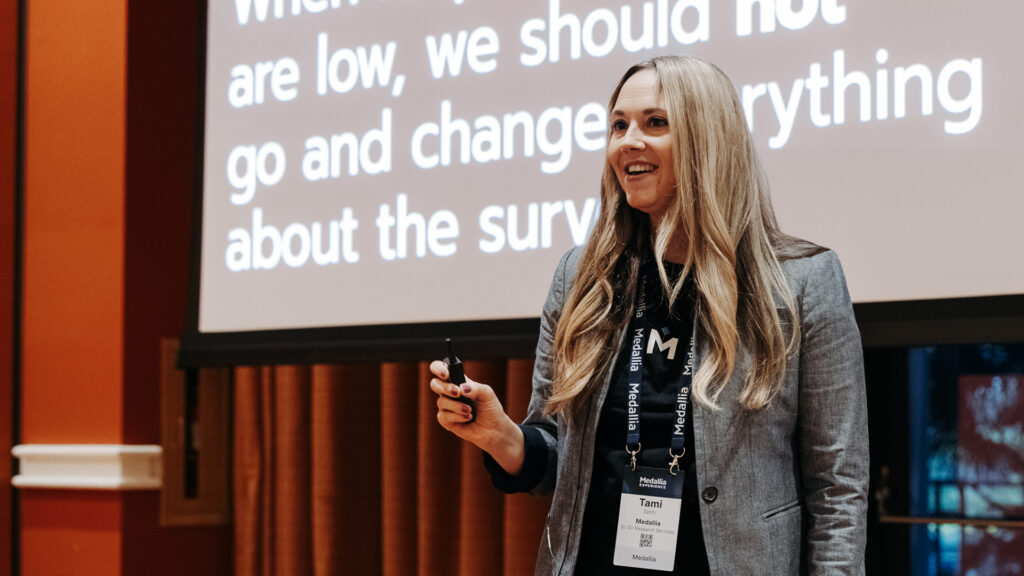
So I can see overall cleanliness in working order [00:10:00] as I scroll down. I’m gonna show you topics to celebrate and topics to focus. These are the same ideas that I just showed you before with the top five and the bottom five. It’s just displayed a little differently. I recently worked with a client who said, I wanna deploy TA to my frontline, but I don’t wanna introduce another metric.
They’re going to latch onto it. They’re gonna try to calculate it, they’re gonna track it, and I don’t want that behavior to start. So can we show this without a metric? Yes, absolutely we can. The benefit of the top five and bottom five is not to identify metrics. It’s really to prioritize what’s going well.
That’s not going so well. And so that’s what you see here in this example. So you could see the top three topics to celebrate and the top three topics to focus. I’d like to do a deeper dive, so I’m gonna do that same click through where I click on the dial. I see that [00:11:00] trend again. And then my favorite top five, bottom five.
And so I can see I’m getting a lot of great credit for the linens. There’s some good feedback coming in there. However, over on the bottom five, I’m seeing kitchen, overall guest room cleanliness. There’s something going on with the sink. Ooh, there’s something going on with the shower in the bathtub. Let me dig into that.
So I’m gonna click into that and guess what I’m gonna see the themes again with phrase level filtering applied. So here as I scroll down. I can see. Okay. There’s a lot of bubbles coming up, but just at a quick glance, I can see there is something happening with the bottom of that shower curtain.
What is going on that needs my attention right away? So I can either take a look at all of the commentary coming in here over on the side. I can click into any one of these bubbles and take it a step further. But what I’d like to show you is scrolling down and looking at segments. It’s set again at loyalty tier, but what makes it really actionable is if I [00:12:00] filter for room number.
Tessa has a million things going on. She needs a way to be able to communicate to her director of housekeeping. There is something happening with the shower curtain in these rooms here. Print this out. Go march to each one of these rooms and solve that problem. And so again, if you scroll down a little bit more, you can see some of the commentary.
In this case, we’re using Medallia video, so you could even listen or even see perhaps the issue that’s going on with the bottom of that shower curtain. So what I’ve just taken you through is leaning into putting TA on your main dashboard, not letting it live on a TA tab. Leaning into traceable filtering as it relates to topics, and then going a step deeper and using some of the segmentation so that the data is even more actionable.
I’m gonna pause here and see if there are any questions. We’d love to take, maybe one or two. [00:13:00]
Q+A: My question is, you were on earlier, the top and bottom five, which I use that I love, but then you are pivoting over to the focus on and celebrate. What is that module, those modules you had that
Laura Kramp: the one that, does it show the impact score?
Is that the Yeah, question. Yeah. It’s called the focus area module. Yeah. So it’s using the impact score behind the scenes. It’s just not showing you the impact score.
Q+A: Okay, so if I wanna pull it in, it would be called focus module. Focus areas. Focus areas. Okay. I’ll save my the other questions for later.
Thank you. Hi.
Q+A (2): So when you went into the pop out filter, we have a lot of customer comments and a lot of times we look at it in chunks of time, mainly monthly. When you scroll down to the topic or the actual comment, like a lot of times I’m looking at an emerging theme or whatever it may be, and I wanna look at the entire timeframe, but the only way to filter through the responses are by [00:14:00] sentiment and.
It’s in chronological order. So a lot of times I’ll have 500 comments for a single day and something could be happening that day, but then I miss the view of all of the responses for the other 29 days of the month. So if we had a particularly crazy promotion. There’s a lot of feedback about a single day, but it’s not easy to sort based on like types of problems, types of com, like comments or like severity of negativity.
You can just filter on negativity. I. Does that make sense? Is there any way to change how you see those comments that bubble up to whatever the topic is?
Laura Kramp: Yeah, the question makes sense. So there’s a couple of options. One, you can update the module to give you more granularity in the sentiment filter.
So behind the scenes we actually have strongly negative and negative as two separate sentiment categories. They’re probably just collapsed for you. In your report, but you could have them separated so [00:15:00] that you could filter down to strongly negative. That’s option number one. And then option number two, we don’t have this in the demo, but you can also use Action Intelligence, which is one of our specialized artificial intelligence modules.
The suggestions module specifically. If you turn that on, you’ll then get the new option to sort by. So you have the option to either sort by most recent or sort by most actual. So then that will bubble up different ones to the top rather than just seeing the ones that came in, in the last couple of hours.
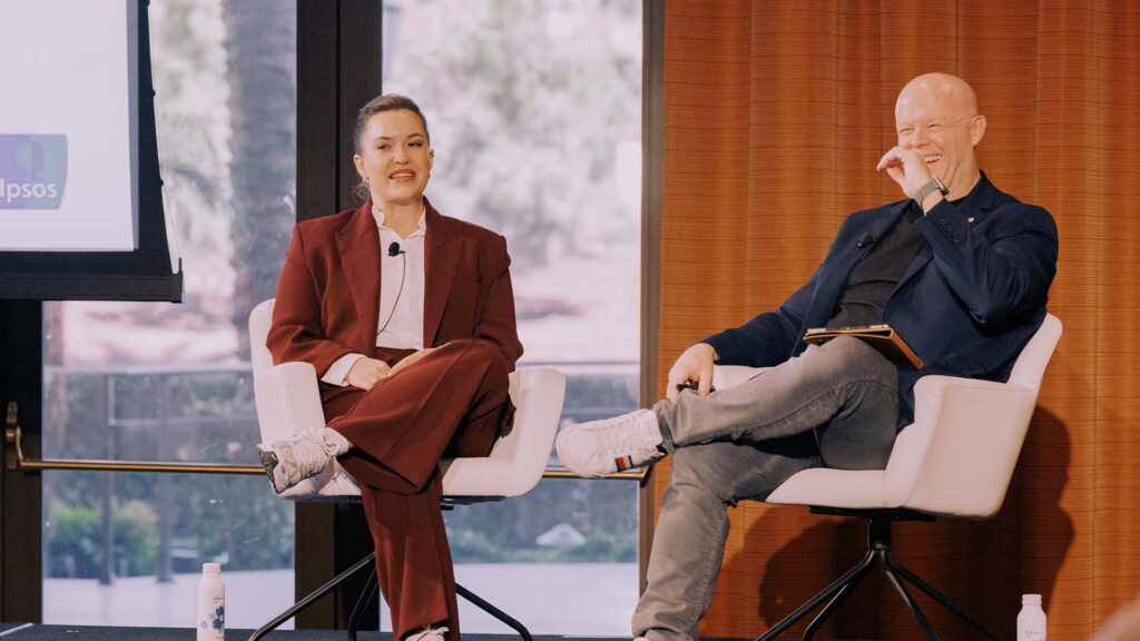
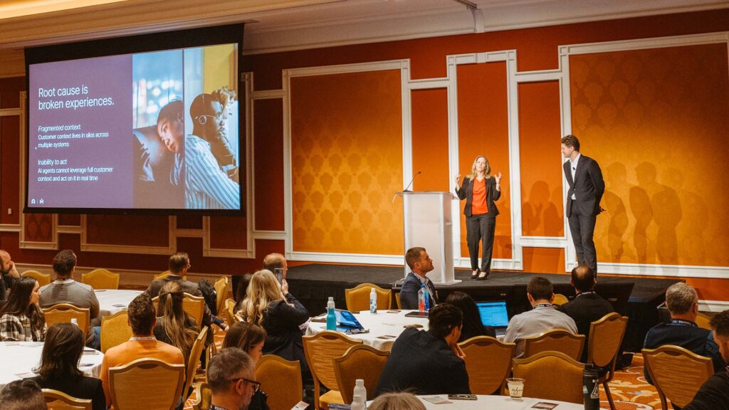
Now we’re gonna pivot to executive use cases. One of the things I wanted to talk about before jumping into the demo is what do you think about when you’re trying to design something for an executive? And one of the biggest challenges I’ve run into is that for executives. They want the right information.
And sometimes that information is pretty granular, but you don’t wanna give too much, right? Because you don’t wanna overwhelm the dashboard. And designing something that truly shows what you need on the page, but [00:16:00] resisting the temptation to add more and more modules that you’re scrolling and scrolling.
I see some people nodding their heads. That’s the biggest challenge because if you have too many things on the page, it’s just so distracting that people get lost in trying to find the answer that they’re looking for. So in the demo that I’m going to show the context is the contact center.
So in the demo you’ll see CSAT surveys along with conversational transcripts from Paul’s and chats that have come into this contact center. It’s the demo scenario is for a bank and I’ll be demoing two different dashboards. So one is a dashboard tracking how an initiative that we just rolled out.
Is going. And then the second one will be a dashboard that shows different insights that can be taken to other parts of the organization. So little nuggets of information that are coming through in the transcripts that can be sent to the digital team or the branch team, for example. We’re gonna start with the initiative tracker.
So the context for this initiative is we’ve recently rolled out a new process for our [00:17:00] contact center agents where we’re asking them to follow up with customers who are calling in to cancel their accounts and ask them. What is the reason for the year cancellation? And then when appropriate offer them some sort of retention bonus.
Because this is a big priority for the company, we decided to build a dashboard specifically to track what’s happening here. So right away at the top, I can see for this current month. So very simple metrics of what’s going on with this initiative. So I can see how many people have contacted us asking for a cancellation.
347 in this case. And I could see that so far, only 4% of those conversations have our Asians asking for that cancellation reason, and only 2% have that actually offering this retention bonus. I see these low numbers. It is a new initiative, so it’s not too surprising, but the next question in my mind is, okay.
Which teams are actually rolling out the, this initiative and which ones are lagging on, act, on rolling it out and making [00:18:00] progress on implementing it. I can still see a breakdown at a couple of different levels, so I can see a breakdown of which teams are offering the most retention offers.
Based on the director level and then also based on the supervisor level. And so the, the number ones in each of these rankers are the teams that are offering the most promotions. So looking at the supervisor side, I can see that Peter Harris’s team is really making good progress rolling out this initiative, right?
So they, they’ve done this for 10% of the calls, which is great, but Virginia’s team is really lagging behind. So right away I have an action, right? I can go to Virginia and say, Hey, what’s getting in the way of your team rolling out in this initiative? Why aren’t we seeing progress? And then at the bottom of the page, if I wanted to look at a few samples of what’s going on in these conversations, I can just see a stream. I’m gonna actually, here’s what I was talking about. Side note. Little distraction, but I can sort my most actionable here as another option. That’s what I was trying to describe.
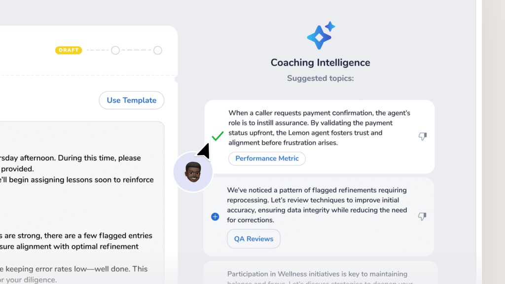
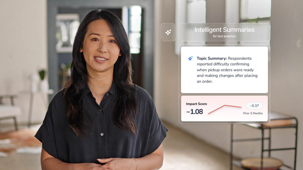
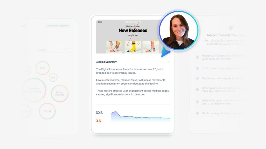
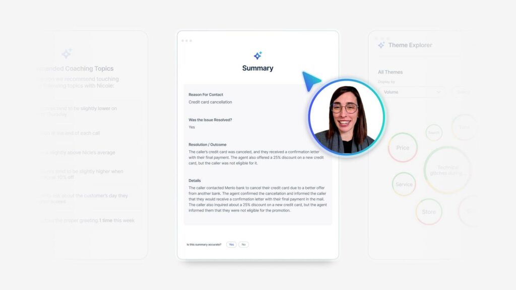
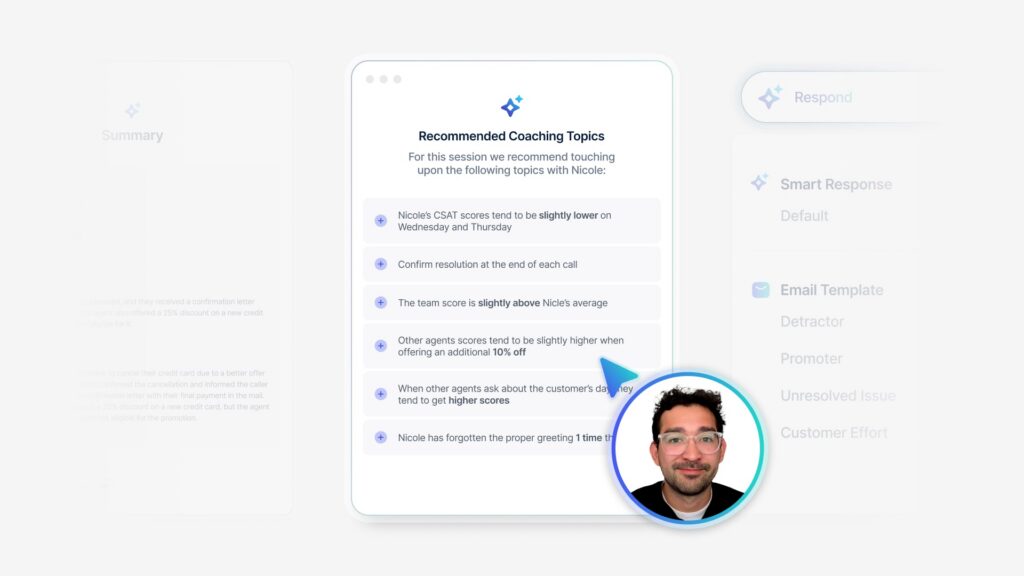
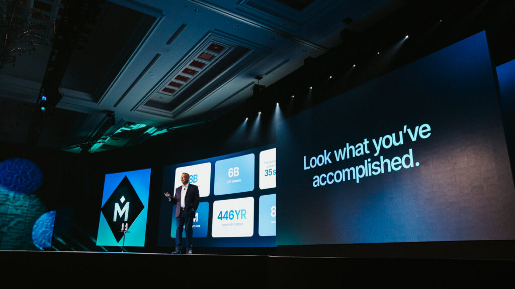
So going back to most recent though just to show you guys an example of the [00:19:00] new intelligence summaries feature. If I wanted to look at one of these particular conversations, I could expand this. And see the summary. And so this was generated using generative ai. This is the new feature that’s just coming out, which we’re very excited about.
And so the system automatically detected the reason for contact. In this case, the person is wanting to cancel a credit card. Specifically it’s detected that by the end of the call this issue was resolved. And it gives me this. Detail around the resolution, right? So I can see that the caller’s credit card was canceled.
They were sent a confirmation letter and the agent did in fact propose a discount to try and retain them, which is great. That’s exactly what I wanna see. But in this case, the caller wasn’t eligible. I. For anyone who hasn’t seen other systems with conversational data, you can also see the back and forth play by play between the agent and the customer, if you wanna look at that level of detail.
But for my purposes, as someone who’s just trying to understand how this initiative is going, I probably don’t be that just having this [00:20:00] summary is the amount of detail that I need, and then I can go talk to my teens about. Making more progress and prioritizing this initiative a little bit more. So that’s example number one.
A couple of things I wanted to call out on this page. One is the sorting, which is a great prompt. It’s almost like I almost like I planted you. So that’s one thing. The other thing though is for anyone who has Medallia Tax Analytics, you might be there sitting there and saying. This doesn’t actually look like text analytics, right?
I don’t see sentiment, I don’t see all impact score, I don’t see all the metrics that I’m used to seeing, and that is by design. So because this dashboard is targeted to towards. Answering one very specific question, we’ve really narrowed down what we’re showing and behind the scenes text analytics is powering all of this.
So each one of these big numbers at the top that’s giving you me my overview of what’s happening. All of those are powered by a topic behind the scenes. But I don’t have to be an expert in text analytics or even really know that text analytics is giving me [00:21:00] this result in order to consume this dashboard.
It just. It shows up as a percentage. Anyone can understand that percentage and let go take action. So text analytics is a little bit hidden, but it is the engine that’s powering this whole page. So that’s example number one. I’m gonna jump to my second example, which is a cross channel insights dashboard.
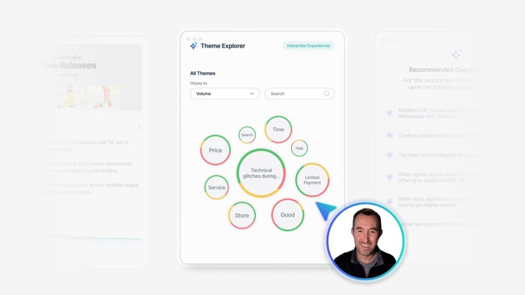
The goal of this page is to pull out those nuggets, add up all of that conversational data. That can be shared with different organizations outside of the contact center. So at the top of the page, I can see, amongst those different channels that I might be interested in tracking website is coming through a lot.
In our conversations. There are fewer conversations about the ATM experience and then also about the mobile app experience, if I keep scrolling. And this is getting a little bit deeper into the contact center. Operational space, but I can now see my opportunities for call deflection. And what this means is if I look [00:22:00] at only the calls that are very short, so in this case less than three minutes.
These are the most common reasons that people are contacting us, talking to someone for a very short amount of time and then hanging up. And so if I look at this as, a really zoomed out from, for the business as a whole, these are the opportunities for the business overall to either drive self-service for our customers to just eliminate those very short transactional calls or to maybe solve some very common problem that’s causing people to call in and solve something really quickly.
And so in our particular case, I can see looking at these very short calls, that almost 25% of them are related to account balance, which is a huge number, right? So if I could get rid of those, that would save a lot of money in the contact center. So if I click on that, I will again get a side panel as Rachael demonstrated to you.
And again, I can see some themes co-occurring at the phrase level. And these are really just telling me what I already assumed that topic was [00:23:00] about, which is that people are calling in to figure out what their balance is in their account, right? Which should be something that they should be able to do on their own, on the website, on the app for some other means, but for some reason they’re getting stuck, right?
So this is a really low hanging fruit for the business to reduce costs in the contact center. That will probably require the health of different parts of the business. And again, if I wanted to scroll down, I could look at a specific conversation and see that automatically generated in summary, just so just to show you guys another example of the new feature.
And then the next two sections on the page are a little bit more focused on specific business units. So I, one section showing me what people are saying about the ATMs when they contact us in the contact center. So very targeted and specific for whoever manages the ATM experience. And then down below I have a section dedicated to different digital experiences.
So looking at what are the different digital activities that people are mentioning when they talk to someone on the [00:24:00] phone or when they chat with someone. So in this case, I’m actually layering on. Two different models for text analytics. So I have my topic model, which is looking at all these different website activities, mobile activities, and digital activity.
And those are topics that were programmed in the background. And then I’m layering on top of that our action inte one of our action intelligence models, which is detecting any mention of effort. So it’s looking for when someone says, oh, this was really hard, or this was really easy, and then highlighting that in the text, and then it actually generates a effort score for the record overall based on all of those sentences that it found that we’re discussing the effort that someone had to put in.
And so what I’ve been able to do, because I have it as a nice numerical score, I can put it into a distribution like you might be used to seeing with your score distributions, but instead this is an effort score that’s just based on the text. And so [00:25:00] I can easily see which of my digital activities are most associated with really hard effort.
And as you can see the five most common digital activities all have a lot of hard or very hard effort coming through, which is not a surprise since they then had to. Go to the contact center for something, and of course I could click on one of these and see a little bit more detail. So in this case, I can see that when people are talking about with the login, registration, et cetera process, about 17% of them are calling in specifically because they forgot their username.
So that’s just another example workflow that would be useful to pull out some nuggets for the digital team. A couple of call outs on this page in terms of the design. You may have noticed that we sprinkled in help text around the page. And this is one of the, our recommendations when you’re thinking about how do I enable my users to.
Actually action on text analytics results and understand what they’re seeing. If you embed it in the page, they’re more likely to read it at the end of the [00:26:00] day, right? So if you put together a user guide and they have to go to a different page and open the document for the user guide, it’s just extra clicks and no one wants to do a lot of clicks.
So if you can put little snippets within the page, it really goes a long ways for helping people understand and contextualize what they’re looking at. And the second thing I wanted to call out, which is just repeating actually something that Rachael said is that each of these, we’ve really decided which topics we’re going to show, right?
So rather than showing our entire topic set and trying to sort on the most appropriate metric to get the right results, we’ve really tailored each section to show only the topics that are relevant. So this is only showing topics related to the A TN. This section is only showing topics related to digital activities and what we said of the dashboard.
We did that very specifically to make it really easy for someone to use it. And so they don’t have to sort through all the noise and spend time figuring out which things they should ignore when they’re trying to understand what they should prioritize for their business. We [00:27:00] also put a few design notes on this page.
Essentially, the recommendation is to streamline. Keep the reporting simple and make sure it really just contains the information that’s truly needed to answer the question and does have a lot of extra things on there. And also thinking about which models, is it topics, is it themes, is it one of the artificial intelligence models are most appropriate, both for the question you’re trying to answer and also for the persona will be using that report.
Rachael Ricketts: So before we kick it over to q and a, there are a couple resources we wanted to make sure that you knew about. First of all, there is a great Medallia user group that’s dedicated entirely to text analytics. The very next one is April 17th, and I encourage you to to follow up with us if you’d like to be a member of that mug group.
And then secondly, reach out to your account teams and have them find some time with Laura, who’s a subject matter expert within text analytics or her [00:28:00] very large team, not large, large. And or the experience advisory team. We’re always here to help support you and make sure that you’re getting the most value out of your instances.
Then the last thing, you see a QR code up here and there’s little tent cards on your tables. We’d love to hear your feedback. What resonated, what didn’t? What would you like us to do differently next time? Please provide your feedback so that we can learn. Alright, now we’d like to open it up for questions.
I.
Q+A (3): Hi. Thanks. This was great. The module that you had that pulled in Action Intelligence, was that a custom module? ’cause I know right now we pretty much have it in a whole separate, just on its own. So is it the, like a custom module do that you built up?
Laura Kramp: Yeah. So when you often, when you turn on Action intelligence, they’ll install it in a separate tab.
And this is one of the things I like to add into the regular text analytics tab for the CX team because I think it makes it more useful. So it’s a pretty standard module that’s very fast to set up, but it is not included in the VPP.
Q+A (4): I this is [00:29:00] Catherine. I work with Cheesecake Factory.
I was wondering what the topics to celebrate and topics to focus on. Is there an easy way for them to generate actual. Guess quotes that they could use for a huddle that shift and, recognize a couple people is that we tell the managers do that, but they find it cumbersome. And I don’t know if there’s a quick and easy way to do that.
Laura Kramp: Yeah, the way to do that would be just to, like when you we’re looking at that module list of three topics, right? Three topics to celebrate, three topics to focus on. You would just click into each of them and just pull a couple of quotes, be the lowest hanging through.
Rachael Ricketts: One thing that I would add too is Laura showed the Action Intelligence and you had asked a question, is there a way to have it not only live within, an Action Intelligence tab?
This would be a great way to lean into the recognition feature of the Action Intelligence. If you click on that topic, you could use Action Intelligence to identify the commentary that’s coming in that is really positive, so that you could serve it up nice and easily.
Laura Kramp: And just to clarify, one of the action [00:30:00] intelligence models is recognition, so it automatically detects employee recognition and shoutouts.
Q+A (5): Hi there. My name is Logan from Pods Moving in Storage Company. Great presentation. Appreciate you guys going through this. I had a question specifically on the effort chart that you showed. I had no idea that there was an effort aspect of it, so that’s very cool. I was curious, one, could you elaborate a little bit more?
Is it just looking for like very easy or very hard or, I had to. Put a lot of effort in, or is it also looking for things like user friendliness and like some of those aspects. And the second part would be, can I apply that same effort style to like topic explorer, like the dials and the circles or like top and bottom topics if I was gonna be focusing on effort instead of like impact score.
So that’d be my questions.
Laura Kramp: Yeah, so to answer your second question first you could slot in for any score. So anywhere you have a C side board, a [00:31:00] ps you could put that instead. So your top and bottom five, you could see impact on it, which is a little complicated, but technically you could do that.
So yeah, you could put it in any of those modules. And in terms of the mod, the model itself it has five different categories. So it detects very hard, hard, neutral easy and very easy. Neutral is usually, there just wasn’t any mention of one direction or the other about what effort the person had to put in.
And depending on the language that’s used, it may, if someone says, oh, it was really difficult to do X, Y, and Z, that’s probably gonna be very hard. But more subtle things like your user experience is not very good. That will probably get the hard rating would be my guess.
Q+A (5): Yeah. All right.
Thank you. I would also just add, I love the side panels. If there was a way to have it default to the expanded view, that would be amazing. Less clicks. But thank you so much. That’s a good point.
Q+A (6): Yeah. Can action intelligence give you a, give you summarization of numerous cases or just one case?
Laura Kramp: Yeah, so the summary that you [00:32:00] saw was for a single conversation. And that feature is called Intelligent Summaries, just to clarify. And that’s one product. But we do have other summarization products that have come out. So we one of the initial things we’re rolling out is a digital summarization, which isn’t a different platform, but it’s like summarizing.
When people clicked here with a digital session, like what happened in a digital session, we also have a summaries feature coming out for topics of deeps in general. So if you like click on a topic, you can see a summary of the most recent 100 or 200 something most recent comments. So there are different summarization features coming out.
We don’t currently have one available right now for summarizing across multiple cases but definitely a great use case. For that, and our product team is looking at all sorts of use cases for summaries, as you can imagine. So we’ll take that back.
Q+A (6): Yeah, no, I think that’ll be really good because I think putting.
Putting those summaries into kind of easier language for people to consume helps quite a bit. ’cause I think in the end you’ve got topics and you’ve got themes. But I find myself having to go down to [00:33:00] the actual comments to say, all right, what does this actually mean in, in language that guests would talk about?
So I really appreciate that. Yeah. Exciting stuff.
Rachael Ricketts: Thank you so much for spending the afternoon with us, Laura and I will stay up here. If there are any other questions you wanted to come and chat with us about, we’re here to help support you. Enjoy the very last keynote. I think that starts at 3 45, and we’ll see you all tonight.