Jeni Batte: [00:00:00] Welcome. We appreciate you all joining us this afternoon, Amy and I today, we’re both from the Medallia advisory team, so we’re here to talk about something that we ourselves spend a lot of time on with organizations. And that’s really about turning the insight that’s being captured into storytelling.
What I’m hoping to do today, as well as Amy, is give you some examples, but also the objective is for you to walk away with an actual framework that you can be using within your own organs nations. As you start thinking about how you can become better equipped to tell the necessary story to key stakeholders in your organization.
What I’d like to do is start with. Just a little bit of a mind bender, if you will. So I’m gonna walk through a few pictures and how you should think about this is what of all of these things are similar in nature. So the first one being, listening to a song, the second Four, sun [00:01:00] Salutations the Third, reading a few pages of a book with your child.
Fourth, making your Bed. Fifth Brewing coffee and the sixth being reviewing about 10 slides in a PowerPoint presentation. Is there anything out there that you find similar in nature to this? And you don’t have to answer me, but just think about it because most of you’re sitting there thinking, no, there’s really not a whole lot of commonality when looking at these individual situations.
And yes, some of that is true. They’re different situations, different people, different circumstances, you name it, lots of variation. But at the end of the day, there is one thing that is similar across all of these, and that is on average, each of these takes about three minutes to accomplish. As we’re hearing some of these stories today.
Have that in the back of your mind of what that three minutes really means. And what’s [00:02:00] super critical about this, in particular for the last one that I showed you about reviewing slides is everybody in this room can relate to reviewing slides, right? More so what it takes in our positions to create PowerPoint presentations and insights, decks and slides after slides, and make sure that we’re getting our point across.
But what often happens is we have a perception of how our deck is going to show up, but on the receiving end, they’re not viewing it the same way. What is the reality?
Amy Anders: Yeah. The reality is that you’ve got about three minutes, especially with an executive audience, and that means you got three minutes of attention.
Three minutes of cognitive bandwidth, three minutes before the next meeting fire. They need to pull out discussion. They need to have happens, and it’s not because your audience or your recipients don’t care about the topic that you are reviewing with them. It’s that because attention is. Frankly scarce for all of [00:03:00] us, right?
And so you’ve got about three minutes. So in that, here’s the real question that I think all of us should be asking ourselves. If you’ve only got three minutes, what do you want them to understand? What do you want them to remember? What do you want them to do next? Because in those three minutes alone, data isn’t going to win.
Volume isn’t going to win. More slides are certainly not going to win. What is going to win is a story that surfaces the tension, a story about real people with real consequences. A story that boils complexity down to something. Decisive. For the next few minutes, we wanna take you through an example.
I want you to imagine that you work for our fictitious company, anchor Credit Union. You’re part of the executive team, and you’re here today to make a decision. The decision on the table is whether or not to deploy a new teller platform across all of your branches. And now don’t panic if you’re not in financial services.
You don’t need to know what that is. [00:04:00] What you do need to know is this is not a small decision, okay? It’s going to affect every member of your frontline. It’s going to have a huge impact on member satisfaction. So your customer satisfaction it affects cost significantly profitability. The long-term growth and potential to bring on new products.
So it’s a big decision and Jenny is going to play the role of an experienced professional on your team. She is bringing you the pilot results for this teller platform today, and she’s done the work, she’s analyzed all the data, she’s crunched all the metrics. She’s brought you whatever executive dreams of a 10 point PowerPoint deck, right?
We are gonna give her three minutes to do it. As Jenny shows you this deck, I want you to stay in the role of an anchor executive, okay? You’re not going to be evaluating her slides as CX or ex professionals. You’re not grading the analytics, okay? You are evaluating this as an executive who has it to decide, [00:05:00] do we roll this platform out or not to all of our branches?
Now you can choose to be the CEO. The CIO, the CFO, the CXO. If you are one of these roles, maybe for the next three minutes put on a different hat and be a different executive. If you’re not an executive, I want you to choose a role that is not someone you usually partner with. Not necessarily your biggest champion.
Maybe if you’re feeling brave this afternoon, choose to put on the hat of the executive. That might often be the most challenging for you. This is the executive hat that you’re going to wear as Jenny walks through the deck, because the same deck can feel very different depending on what seat, what point of view you have.
Okay. Are you guys ready? Hey, Jenny, take us away.
Jeni Batte: So remember, I’m the CXEX professional and I have three minutes to wow my decision makers. Okay? So what I wanna start with is the executive summary. I’ll break it down for everyone. Make sure everybody is [00:06:00] crystal clear on the purpose of why we did the pilot to begin with.
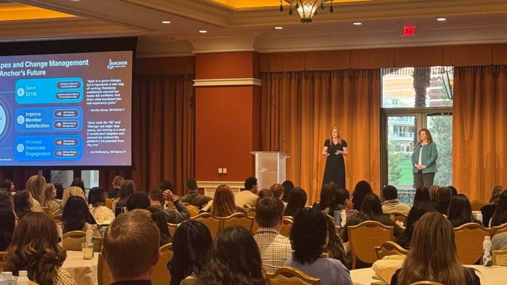
So Apex was selected through the RFI and most of that they were chosen for their potential to replace both teller and lending platforms. So the end goal here is for potential savings of $21 million annually. We decided to do the pilot phase with the central region and Q4 and some of the highlights that we have here.
The highest system uptime of all regions in this central region. So system-wide were looking good. Fastest load time of all regions. However, where we saw some declines had to do with member satisfaction, payroll expenses increased an associate tenure and engagement. Both declined as well. Here’s another summary with the results and we’re breaking it out by the specific regional breakdown.
So you can see here in the summary that across the regions central, just like I [00:07:00] said before, has an uptime and a system load time that’s increased, but the rest of these metrics have declined in nature. So now we go into the individual metrics themselves. The system uptime. So once again, it looks as if the central region has had the highest system uptime.
And you can also see, however, that all of the other regions are an acceptable timeframe and the districts themselves, if you break it down by this particular region, are all close to that a hundred percent mark. We did have a blip in P one with an issue. But it didn’t necessarily pertain to the outcome of this.
Then we have the load time, very similar in Nature Central region had the fastest load time. We obviously want to make sure that it’s tied to some sort of ROI if we began to get the fastest load time. So that is tied to, more revenue as far as what we’re looking for across [00:08:00] the board. We start to see some differences is with the member satisfaction.
So interestingly enough, central was the only region to experience declines, and you can see that across the board. What you can also see is some of the. Key text analytics topics that we’re seeing long lines drive through weight, those types of things with verbatim comments that help support that most of the other districts in the region also decline with the exception of district seven and 11, which both increased as far as member satisfaction.
Then we look at payroll central region. Payroll increased as we saw a part of this has to do with the different districts that I just talked about. Seven and 11. Both of those, we conducted very specific training that was associated with it during the month of October. So we’re seeing a little fluctuation there.
We’re also seeing some declines in associate engagement. So again, central [00:09:00] region. As comparison to the other regions, we’re seeing declines in things like associate engagement, tools needed to perform job, so drop offs there. Also, we’re seeing an uptick for district seven and 11 and associate engagement change.
So what are our next steps with these learnings? What we’d like to do is calculate ROI of the system uptime. We wanna consider extending the pilot in the central region to see if member satisfaction stabilizes. We want to review exit interviews to see if Central’s lower turnover was attributed to the system itself.
We’d also like to conduct in branch time studies to validate wait times, and finally revisit the two other competitors with a deeper dive on member satisfaction to learn more about them as well.
Amy Anders: Go ahead and stay in the role of the executive that you chose, right? If you’re the CEO, I wanna ask you, did you hear a clear recommendation?
If you’re the CIO, is the decision [00:10:00] simpler or harder? Now, if you’re the CFO, can you tell us what the risk return trade off is? If you’re the CEXO, do you feel like screaming or just running out of the room right now? The decision isn’t easy and that’s not because this data is bad. In fact, it’s a solid deck.
It’s responsible, it covered all the aspects of the pilot. It’s real work represents a real analysis. That we’ve seen. So if this deck felt familiar to you, though, I wanna say that’s not coincidental. Jenny and I work with a lot of folks in this field, and this is the most common type of executive readout we see in experience management.
Okay. Region by region comparisons, metric over metric. Trend lines, right? You’ve got opportunities, surface risk, called out. You’ve always got this next step, a lot of next step potential, next steps at the end. It was meant to feel familiar. I know probably I can see some head s nodding. Many of you have probably presented a deck like this.
I know. I certainly have many times. And the challenge isn’t the [00:11:00] rigor that’s put into it, right? Or the thoroughness, or the relevancy of it. The challenge is that this deck doesn’t make the decision clearer. It tells us what happened, but not what needs to happen next. It gives us information but not clarity, right?
And in a three minute window, that distinction really matters. That’s where storytelling comes in. Now, storytelling is not about dumbing it down. It’s not about removing data at all. It’s about organizing complexity in a way that helps your leaders make decisions. So over the rest of the session, we’re going to take a look at how a 10 slide deck, like the one Jenny presented, one that’s well-intentioned and very thorough.
And we’re gonna turn it into a story that actually works in three minutes. So we wanna begin with why storytelling matters.
Jeni Batte: So fun facts. People are 22 times more likely to remember facts if they are presented in a story format, and I think that’s very relatable. [00:12:00] Interestingly enough, however, we don’t do that very frequently.
We’re often very focused on raw data and percentages, and maybe we have a point of view, maybe we don’t, but we put a lot of numbers. On slides and have an expectation that people understand and interpret the information, and that’s just simply not accurate. So the more that we can build out why it’s so important to tell stories, the better off we’re going to be.
And a few other reasons why that is. So outside of just it being memorable. To tell stories during your presentations is also to introduce business benefits. Let’s say that you’re trying to sell some ideas or products in your organization. You’re trying to build trust and credibility. So often what we find is when we’re presenting.
If I have a specific real life example that I can share with other people, the [00:13:00] head’s nod as we’re seeing, and it’s really relatable. You can put yourself in the person’s shoes when they’re telling the story and they’re having the experience with you, and that’s what we’re trying to articulate.
With data and many other things that we’re presenting in front of key stakeholders. Your team, you name it, making sure that it’s personalized to the extent where it has more meaning than just a lot of numbers on slides. So what I’d like to do is talk a little bit about the impact storing framework. And so when I mentioned this earlier on, this is the framework that we’d like for you to take away.
Eventually as we wrap up today. So I wanna walk through what this means, and then we’re going to go into a bit more detail about each one of these. So the first one being identify the big idea. What are you trying to articulate? What is the headline that you’re [00:14:00] trying to share on a slide? How many times have you spent a number of minutes on a slide trying to articulate something where it would.
Be much easier if you had really given some thought in advance about what you’re trying to communicate, and put that in the headline to start as your lead in. Often we just get overly complicated on our slides and it leads to a misunderstanding of the data almost immediately. The second one, the m is marshal the data.
So I’m sure you all hear this all the time. Analysis paralysis data. I don’t know how to sort it. I don’t know what’s important. I don’t even know what to present, but I know I have a lot of it. So marshaling the data is really about taking what you have and understanding the most valued pieces of that data in order for you to eventually move forward with taking action in your organization.
Provide your point of view. This one is a big one. Show up with a perspective. If you are the [00:15:00] one that’s putting together the data and you’re messaging the slides and you’re sharing it. You should understand what that data is saying to you, and you should have a point of view of how to communicate that to your organization.
That builds credibility and trust in your presentations aligned for the audience. How many people have showed up to a meeting they’ve been requested to attend? Data’s being presented, lots of sides, and you have no idea what you’re doing there. Okay, waste of time. There’s nothing about this information that’s even remotely, important to me in any way and in our world of being very short on time and trying to be efficient.
It’s problematic when that happens, right? So paying attention to who your audience is, what’s in it for them is part of the framework. Calibrating with others, and I know people will probably push back and say, oh, I don’t have time for this. But being [00:16:00] able to include other people, team members, bounce ideas off of, run some of your slides and your data points and your story past other people before it gets to the final audience is also very important.
Many of us are looking at the data a lot. We come up with our own conclusions, so we think we’re right. For the most part, right? What we’re about to present makes sense, but oftentimes we need other people’s perspectives to poke holes in our theories. And so this is an equally important step. The final one is tailoring the medium, and we’re gonna get to this and what we’re gonna talk a little bit about today is there are actually other channels and opportunities to share data outside of PowerPoint presentations.
What I’d like to do is hand this over to Amy and she’s gonna talk about the first one, identifying the big idea.
Amy Anders: Thanks Jenny.
Okay. So we’re gonna spend a little bit of extra time on the eye impact, and that’s because if you don’t get the big idea nothing else in the framework is going [00:17:00] to matter.
Nothing else can save you. You can marshal the data perfectly, you can align for your audience beautifully. You can calibrate for weeks if you want, but if you don’t know what the story is that you’re actually telling you are gonna end up right back where we started with a bunch of slides. I found that there are four practices that consistently help me surface.
The big idea when I’m looking at data first is to find the tension. Second, follow your curiosity. Third. Let the characters lead and forth, boil it down. These aren’t steps that you need to check off every single time, okay? They’re just a different practice that you can choose to employ as it fits the data that you’re looking at.
We just find that it helps us uncover the story that deserves those three minutes. So let’s start with the first one, finding your tension. Every strong business story has attention, right? Attention is simply the opportunity or the problem that your data is pointing to. And so if you can’t name your tension in one sentence, then you [00:18:00] don’t yet have a story, you still have a report.
Inexperienced work, we tend to see attention show up in kind of four different ways, either a gap, a trade off, a risk, or a missed opportunity. And I’m gonna step into each one of those with the anchor data that we looked at earlier. A gap is going to ask how far are we from where we expected to be, right?
So in anchor’s case, that gap is pretty clear. The system performance with the new APEX system in the central region was fantastic, but member satisfaction declined, right? So the tension here isn’t, does the APEX system work? The tension here is why are better systems coinciding with worse experiences?
A trade-off is going to ask what are we gaining and what might we be sacrificing? So at Anchor, this trade-off shows up where it often does for many of us in this room, between operational efficiency and the human experience. And so the tension [00:19:00] becomes, are we trading experience debt for technical efficiency?
A risk is going to ask what happens if we don’t intervene? So in central, you remember the associate engagement dropped, I think nearly 10%. And so the tension here is forward looking. It’s if we scale this platform as is, do we amplify that burnout and churn? And the last one, a missed opportunity is going to ask what could be true that is not yet true.
And so in anchor’s data, if you happen to notice. Some districts did have positive associate engagement and strong member satisfaction, right? Especially where I think training was hands-on. Leadership was present. That tells us something very important. The tension becomes what value are we leaving on the table by not pairing strong technology with strong enablement.
So notice what changed up here. Same data, same 10 slide deck, four [00:20:00] different tensions, four different stories. Four very different stakeholder conversations. Once you’ve found the tension, another practice we like to do is to follow your curiosity, and this might be my favorite one. This usually starts with noticing something and thinking, huh, that’s odd, right?
When something stands out in the data, a number, a pattern, a contradiction, don’t try to explain it right away. Don’t head down that rabbit hole right away. Put a pin in it. I’ve learned to trust that instinct. Complete the rest of your analysis and come back to your pins. Follow that curiosity things.
Catch your attention for a reason. Okay? Especially those of you that have been doing this for a long time, you may not know why something is standing out to you. You may not be able to yet articulate it to someone else who’s looking at the data. But when you follow that curiosity, especially the thing you find interesting that no one else on the table is looking at.
Chances are, that’s where you’re going to find your [00:21:00] big idea. A great example of this is one of my favorite movies, Moneyball. Moneyball is based on a true story of how the Oakland A’s use data analytics to build a successful baseball team on a limited budget. I think many of you in this room, maybe even most of you in this room, are kind of data nerds like me, so I’m gonna guess many of you have probably seen this movie, but if you have not.
Write it down on your action plan. That’s your homework for the trip home. It’s a fantastic movie. So Moneyball is based on a book that was written by a gentleman named Michael Lewis, and he originally went to Oakland. Curious about a very narrow question. Why do some baseball players on the field?
Earn more money than other baseball players on the same team. Okay? So he went out to Oakland to investigate that they were willing to talk to him, and he was originally going to ride an op-ed. So that was the question that got him in the door. Why do some baseball players make so much more than others?
But once he was there, something else caught his attention, or I should say someone else caught his [00:22:00] attention. And that was the general manager, a gentleman named Billy Beam. The way Billy talked about players, the way he questioned the system. Lewis followed that curiosity and it led him to a bigger story.
And that brings us to the next practice, and that’s to help you identify the big story, and that’s to let your characters lead. Michael Lewis, the author didn’t decide in advance that Billy Bean was the story. Okay? He discovered it by paying attention. Remember, he was out there for something else, but he was curious about Billy.
And so the more he learned about Billy, the more he wanted to know if you’ve read the book or seen the movie that the story really emerged or evolved from a place where Billy Bean himself began his own baseball career. So he was overvalued. As a young recruit and then wasn’t successful and that haunted him enough to later as a manager reinvent how players were recruited and ultimately valued.
So what started as an op-ed [00:23:00] turned into something much more compelling about how we value talent, and that’s what led to Michael Lewis writing a book, which became. A very popular movie. The same thing happens to us in experience data, maybe not with Brad Pitt, but the same thing happens with us, and that’s that it’s very easy to stay focused on the story you’re there to report on, right?
So in the Apex example, we could be saying that has a lot of operational efficiencies, has the potential to save us a lot of money, but it’s going to cost us in member and associate engagement. So that’s our story. But if you follow your curiosity, some characters. Besides the central region began to stand out, and that’s district seven and 11.
Despite everything happening on this very busy slide in the central region with member satisfaction, districts seven and 11 actually performed very well. Satisfaction was higher. And with all the numbers on the slide, you almost miss it, right? So they’re over there to the right, and maybe some of you did.
That District seven and 11 actually had higher member satisfaction, not just than the [00:24:00] other districts in the central region, but higher than all of the other regions. And the same thing is happening with associate engagement. It was also higher in these two districts. And when you dig in on this comment in the bottom right hand, which comes from one of those districts, you find that it’s because leadership was present.
Training was very hands-on. Support showed up early, right? This is suddenly means the story isn’t about a struggling region. It’s not about central falling behind in these metrics. It’s not even really about the Apex system anymore. It’s about something that changed the outcome entirely. I think this is a hard part for a lot of us or for some of your teams, and that we feel like we have to stay where the story started.
We have to stay with what the depth was intended to do. Summarize this pilot and tell us what to do based on this pilot, but if you let the characters, in this case, the districts, the data for District seven 11, if you let the characters lead. You’re gonna end up somewhere much more compelling, and so storytelling gives you the permission to move the spotlight, and the data is [00:25:00] going to lead you to something where you might really impact change.
Once you follow the curiosity and you’ve let the right characters take the lead, the final step is making it simple enough to survive your three minutes, and that’s where we go next. Just to boil it down, this is where a lot of you’re getting nervous. I can even see it in some of your faces as your head’s lifted up, boiling it down.
I’ve got a lot of good data, Amy. I don’t wanna boil it down because it can feel like you’re cutting out a lot of important nuance, right? But when I feel like I am close on a big idea. I like to boil it down to three elements, a character, a goal, and a challenge. So the character in our story is not the Apex system that we’re piloting.
It’s not even the central region. The characters are district seven and 11, because that’s where something different occurred. Okay. The goal is not successfully implementing this APEX system. The goal is to deliver a great employee and member experience, right? That’s our goal, and we’re gonna try to do that while realizing the efficiencies and the cost savings associated with [00:26:00] this new system.
That’s the outcome that your executives really care about. And the challenge quite clearly is that there’s a learning curve with the APEX system. That’s our challenge. Without the right support, that shows up as stress and long lines, but with the right support, it shows up as competence and confidence, consistency in the experience.
And so when you boil it all the way down, the story isn’t about a pilot at all. It’s about how Apex creates value and people are supported through change. Finding the tension, following your curiosity, letting your characters take the lead and boiling it down. That’s how you identify the big idea. Once you have that, everything else in the impact framework gets much easier.
So we’re gonna move to the end now and let Jenny talk through that.
Jeni Batte: So I had mentioned this a little bit earlier with marshaling the data. And again, it’s often where the storytelling gets misunderstood because as I said before, it can be analysis paralysis, lots of data. [00:27:00] Unclear on the direction to go, what’s going to be most valuable as far as your audience and many other things.
So what you’re trying to do with marshaling the data is organizing the stories for them to ultimately have meaning. So a couple of things to note in terms of marshaling data. Select the data that brings the story to life. That may sound like a no-brainer to everybody here, but it’s often very difficult if you’re not positioning it the right way with the big idea to start.
It becomes very challenging to get there in an efficient way. Separate the decision critical data from interesting noise. This is where we often get hung up. Let’s say you saw a data point NPS declined two percentage points, and you go down a rabbit hole in text analytics and you end up six hours later with no answers and no conclusion.
Not a great way [00:28:00] to spend your time. So making sure that you’re understanding where you want to spend time is super critical, and this is the biggest one. If you can take away anything, when you think about that 10 slide deck, you can actually leave data behind. You don’t have to put everything in every single slide.
You can start at the high level with the most important parts, and then you can go a step further if and when necessary. So this is a great example of a slide. It was a nice to have, but necessarily important or overly relevant to the story that we were trying to tell. The answer is no. It was good to validate.
But put it in the appendix, so I’m sure many of you’re going. We have a lot of these appendix slides that we could be, placing elsewhere in presentations. But again, starting with that big idea allows us to be far more [00:29:00] efficient. A good rule of thumb is select three to five metrics that you wanna focus on in any of your storytelling.
Beyond that, you’re going to get lost in what you’re trying to articulate, and the story is no longer something that’s easy for people to digest and embrace. So pro tip to you, if a data point doesn’t change the recommendation, it does not belong in the story. Number three.
Amy Anders: Okay. We’ve all heard the phrase right, that the data speaks for itself, but the truth is that it doesn’t, without a point of view, data is pretty silent, and silence can create ambiguity.
When slides are unclear, it’s not like they’re just sitting there taking up space. It’s actually a risk for you because they can get repurposed, right? Has anyone had that happen? I’m seeing a lot of heads nodding. Okay. So sometimes in ways that actually work against. What you’re trying to accomplish.
Think back to our original anchor deck, right? One or two slides from that deck could be repurposed, easily pulled into another [00:30:00] conversation and used to say, apex, our new platform is a bad investment. So that may not be the story that you meant to tell, but without providing your point of view. It becomes a possible interpretation, right?
The data was there. So the reason it’s really important for us to provide a point of view, I think, is that we also have a tremendous responsibility here. Most of you in this room, I would say know your CX and or ex data better than anyone else in your organization. So just handing it over. Hoping it lands correctly, isn’t neutral.
It’s actually very risky. Maybe even I would venture to say irresponsible. When you marshal the data and provide your point of view, you’re gonna protect the meaning of your work. You make it harder for the story to be misunderstood, right? One simple way to clarify your point of view is to try to write it as a complete sentence.
For example, we want leadership to invest in both change management and in Apex. So I boiled it down to one sentence. That’s my point of view. It’s going to reframe your work as purpose built. And I wanna say [00:31:00] too, that your verb really matters here. So many times I see a point of view that doesn’t even have a verb, but if you have a verb in your point of view and you should, it needs to be important that you really think about it.
Are you asking leadership to invest in something? Are you asking ’em to change something, to stop something, to test something? Be very intentional with your verb. Now, there are a lot of. Storytelling frameworks out there that will help you structure your point of view. There’s like things like Hero’s Journey three act structure, and you guys will all get these slides, so I encourage you to research some of these different storytelling structures for organizing your point of view.
But for business storytelling, I personally like the pyramid. Principles. Anyone in here familiar with Perrine principles? So it’s where it’s a really simple and persuasive framework for your point of view. You lead with your answer, your main point. That’s the first thing you share. Then you support it with a small number.
I think Jenny said three to five metrics tops, right? Of high level insights, and then you back those up with data. Before I came to work at Medallia as an advisor, I worked in retail for a long time and very early in [00:32:00] my. Time as a CX professional before CX was cool. I reported to this president of retail for our organization and he was fantastic.
Like he really genuinely cared about our customer experience. He was sharp, he got stuff done, and I think he really trusted me, but I found that anytime I brought him a point of view, like a recommendation on something. We very rarely could get through that without him interrupting me a lot and taking us down sidetracks.
And because he had so little time, sometimes I would walk outta meetings with him and quite literally think, I don’t think he even knows what my point of view was, and then we did this team building thing. He wasn’t a part of it. It was for my immediate team. Whereas, like a personality test.
Some of you have probably done lots of different versions. This one was called True Colors. I learned that I’m a green, and a green means that you’re very analytical, you love data, you love nerding out over charts and things like that. And I learned that many times leaders in our organization we’re a color orange.
And orange [00:33:00] meant that you. Don’t need a lot of data. You wanna make a decision quick. It’s a very common color orange is a very common color for leaders to become. And I’ll never forget when the facilitator of this. Team building said a phrase that really stuck out to me. She said, oranges want you to spare them the labor pains and just give them the baby.
And I thought, oh, that’s Bill. That’s Bill. And so I started immediately doing that. When I would meet with him, I would go in even though I really wanted to. Start with, here’s the problem and how I found it, and here’s all the data and all the weeks I spent working on it and all the different alternatives I considered.
I wanted to start there, but I didn’t. I flipped it into this pyramid where we started with our main point and then the data’s there, right? I’m a green, I’m gonna have data for weeks so he could poke and we could go anywhere we wanted. But because I started leading with that main point, stuff started getting done and that’s where we really took off.
I later. Talked to Bill about it. And he laughed and he said, yeah, Amy, you do love the labor pains. For, I try not to be offended. There’s some truth in that. For Apex, the [00:34:00] main point is that we want to invest in Apex system and change management, right? And then the top three insights would be about the savings, the member satisfaction, and the associate engagement.
One tip I’d like to offer for finding your point of view, if you’re struggling, if you’re looking at a lot of data and you’re saying, honestly, Amy, I don’t have a point of view on this. It comes from Nancy Duarte who authored a fantastic book called Data Story. If you’ve not read that book, highly recommend it.
Nancy says, when you need to shift into creative mode. Move into a different space than the one in which you crunch your numbers signal to your brain to work in a different modality by changing your work area. All right, so we’ve identified the big idea. Marshal the data, provided our point of view. Jenny talked to us about a
Jeni Batte: yes.
So aligning for the audience. Once again, quite frequently we walk into rooms. We present, we’re not quite sure who’s gonna be there. Hopefully we do have some sort of preview into who’s going to be in attendance. There’s a variety of different roles and responsibilities in organizations, as you [00:35:00] just saw in the example early on, of wearing different hats.
So it’s equally critical for us to understand who the audience is that you’ll be sharing the data with. And making sure that there’s value across the board, across the organization. And it’s even more important when we think about how we’re pursuing things like omnichannel and a variety of different parts of the organization to bring them in.
So understanding who is my audience and what do they care about is very critical.
Amy Anders: This is where you really pressure test your story right before it ever makes it into a deck or a dashboard or into a meeting. One way we like to recommend you do this is what we call the coffee bar test. So the idea is really simple.
Can you explain your idea or share your finding with a colleague in a casual setting? And this is where you’re gonna actively look for blind spots. Okay? So when you share your story with others, pay attention to the questions that they’re asking. [00:36:00] Are they confused about the big idea? Are they jumping to conclusions that you didn’t intend?
This step is going to help you anticipate objections from your final audience, so calibrate it with others. And then Jenny, that brings us to our final letter,
Jeni Batte: T Taylor, the medium. So as I mentioned before, not everything has to be in PowerPoints, and I know that’s soul crushing for many of us here, but that is the truth.
So again, as you think about the framework that we just talked through, thinking about your audience, all of those things tie back. To this, right? So it’s not just about who you’re presenting to, but it’s how you’re presenting the information. How do they ingest? What do they find to be meaningful? And unfortunately, PowerPoint isn’t always the way to go.
So just make sure that you’re thinking through other avenues, maybe even getting their opinion on what’s going to work best for you when we come to the table in these meetings. But I can say with certainty, 30 slide decks to key decision [00:37:00] makers is not working. Okay, and the reason that we spent all of this time going through the framework is to reach this point, which consolidates what we’re trying to do with the original story and the impact framework.
Ultimately, we wanted to consolidate this in a way, using each of those steps to make sure. That as a takeaway based off of the original sides, there are things that can be actioned on because ultimately when you’re presenting this, it’s not just about next steps because that goes out into the universe.
Nobody even knows what the rule or action is when you leave generic things like that as a leave behind inside, what does stick is something of this nature. Okay, this is the new version of the story, and it’s not a different story. It’s the same data points that we already covered, but it’s now consolidated into a summarized [00:38:00] format.
What is the big idea here? Hopefully it’s pretty clear to all of you. Anchor must invest in Apex and change management, so they did a great job of the system, but there were some nuances going on with member satisfaction and associate. We marshaled the data to understand by piloting first. Unpacking, what were the things that were going to be most important?
We also shrunk down the three things that we really wanted to say in this, and again, it had to do with ROI saving 21 million. We were able to deliver on that, but there were other things associated with it To be ultimately successful and to be able to form recommendations for key stakeholders of what they can be doing with this.
So again, summarized, efficient, straightforward, and the beauty of this is if anybody in the room had a question and needed [00:39:00] additional detail or insight, they could click into that and they would find additional data, additional slides, but you’re not absorbing everybody’s time and the audience talking about things that may not be meaningful for everybody in the room.
All
Amy Anders: So as we close today, I just wanna come back to where we started, which was that original three minutes, right? That’s the window that most of us are gonna have to influence change in our organization, and I hope that we’ve convinced you that if you walk into those three minutes as data people, you’re going to be informing.
But if you choose to show up as a storyteller, you’re going to be influencing change. Every one of you in this room is sitting on data that’s very powerful and can make a huge difference for your organization. Insight only creates impact when it is understood, when it’s remembered, and when it’s acted on, right?
That’s the power of storytelling. We’ve got some resources, as I mentioned. You’ll get these slides. Here are some of the resources that we love. If you wanna go further on this, please add the movie Money Ball to your list that’s on this [00:40:00] resource list too. Participate in the survey if you wouldn’t mind sharing your feedback from today’s session.
Jeni Batte: Thank you.